Basic Strokes - Lowercase

Sign up to my email list to get this free printable.
Topics to Recall
Paper Position and Nib Alignment
Getting to Know Your Nib (Pressure and Angle)
About the Worksheets
My worksheets are heavily based on Engrosser’s Script (ES) as taught in The Zanerian Manual. At the time of creating these worksheets (October 2019), I was over a year in practicing ES using The Zanerian Manual as my standard, but three years in from first picking up the pointed pen. The worksheets were written by hand, scanned and digitized in a printable PDF format. There are flaws for sure, but they were the best I could produce at the time and I’m proud and happy to share them to anyone who can find it beneficial. As I progress and get better (as we all do with practice), I will probably go back and update them.
The guidelines I used on the worksheets have 8-millimeter spacing (x-height). It’s easier to learn with bigger spaces because you are able to spot errors better and the taller x-heights give you some time to think and transition the pressure you apply on your pen.
The slant lines are on a 55-degree angle, which is a common angle used for ES. You can choose a different angle, just make sure to stick to the same one as you practice.
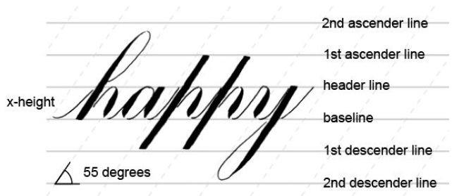
The guidelines in the worksheet have 8 mm spacing and 55 degree slant lines.
Note: Here, the loops don’t touch the 2nd ascender and 2nd descender lines exactly. If you choose to leave a gap similar to this, just make sure to reflect the same gap on all your loops. Same goes for the letters that only reach up to the 1st ascender and 1st descender lines.
2nd Ascender Line - the topmost line where upper loops of b, h, k, etc. can reach up to
1st Ascender Line - where the top of letters p and t reach up to
Header Line - where the top of letters like a, c, e, etc. reach up to
Baseline - where the bottom of letters like a, c, e, etc. sits on
1st Descender Line - where the bottom of the stem of p stops at
2nd Descender Line - the lowest line where lower loops of g, j, y, etc. can extend to
THE BASIC STROKES
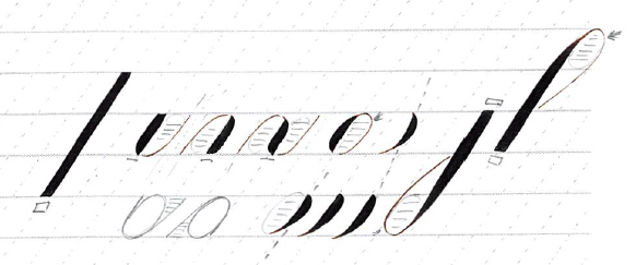
Descending/Lower Loop - combined video below
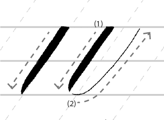
1. FULL PRESSURE STROKE

Full pressure stroke is only ever used in lowercase p

A parallelogram is a four-sided shape where each side is parallel to the one opposite it.
Characteristics to aim for:
Top edge is straight and horizontal.
Shade has equal width from top to bottom.
Left and right sides are straight.
Left and right sides are parallel to each other.
Left and right sides fall along the 55-degree slant.
Bottom edge is straight and horizontal.
Four corners are pointed.
Basically, a shaded parallelogram!
When practicing, I suggest you pick one characteristic at a time and focus on getting that right before adding another.
For example:
First, focus on executing the shade as aligned to the 55-degree slant as possible. Recall Paper Position and Nib Alignment.
Next, practice getting even thickness. You do this by maintaining even pressure as you pull the pen downwards. Recall Getting to Know Your Nib (Pressure and Angle).
Practice in one space, two spaces, and three spaces (which is the actual number of spaces the stem of a standard letter p takes up).
Make sure you don’t get a shade that is too thick because the amount of shade you give here should ideally be the same amount you give to any other shade (on the other basic strokes like the shade of the oval, for example).
Then, check if the left and right sides of your shade are straight and not jagged. If they’re jagged, it could mean that your nib is not aligned to the 55-degree slant while you’re writing. Recall Paper Position and Nib Alignment.
Lastly, practice getting straight top and bottom edges (do top first, then bottom, or vice versa). This is the hardest part. Don’t worry if you don’t get it right the first time. It could take a lot of practice getting to know how the nib works and having it work for you. I have a method below that works for me currently; hopefully you’ll pick up a tip or two!
Practice one characteristic at a time until you feel ready to combine all of them.
There are several ways to do this basic stroke. Here’s my personal take on it.
Step-by-Step Process:
Rest the right tine on the paper. Do this by turning the nib slightly to the right. Or if your pen holder is already set this way, there’s no need to turn your pen.
On this video, I show you what happens if I keep both tines resting on the paper and I apply even pressure to splay out both tines. Try it out for yourself. The top you produce would likely have a downward curve instead of a flat top. Or, if you are holding the pen too steeply, it could result in an upward curve.
You could also produce a flat top by turning the nib slightly to the left, but this one feels counter-intuitive (at least for me) because the nib would fall off the slant and I’d have to readjust it before doing the next step.
Some people also start by drawing a small horizontal hairline where you want your flat top to end up. When you do this before the rest of the steps, the ink will usually pool and stop at this hairline that you drew, thus creating that flat top.

When my nib is at a 45-degree angle from the paper, the flat top I produce is not horizontal and not aligned with my guideline.

When my nib is at a 60-degree angle from the paper, the flat top that I get sits exactly on the guideline and is horizontal.
2. While keeping the right tine in place, apply pressure to spread the left tine horizontally.
Depending on how you hold your pen, you may need to play with the angle of how high it is in relation to the paper to get a flat top that is straight and horizontal. In these photos, I compare the results of my holding the pen in a 45 degree angle from the paper versus a 60 degree angle. Try and see what it looks like for you!
3. With the nib aligned to the 55 degree slant (from top view) and the tines spread out, drag your pen downwards while applying even pressure.
Don’t rush between step 2 and step 3 because if you start pulling the pen downwards before you’ve completed the flat top, the top corners might turn out rounded instead of pointed.

Top and bottom edges have “triangular gaps” that need retouching.
4. When you are near the bottom line (depending on how many spaces you’re practicing with, it could be the baseline or 1st descender line), slowly release the right tine and let it meet the left tine while running it horizontally across the bottom line.
For some people, doing this quickly and snapping the nib back into place results in the desired flat bottom. For me, that usually results in a pointy corner that I would usually need to retouch to make it look like a flat bottom. I don’t mind retouching; it’s a smart thing to know how to do, but it’s definitely more efficient if I could do it in one motion.
Video Tutorial - Full Pressure Stroke
References
The Zanerian Manual has good drawings that show how the tines should look like while doing this basic stroke. There isn’t a lot of written instructions about this one but I found the visuals to be really helpful.
Dr. Joe Vitolo has lots of tutorial videos on copperplate script. Here’s his video of doing squared cutoffs that I think is very helpful too. He also talks about jagged edges in his book, Script in the Copperplate Style, which I found really interesting as getting jagged edges is something I do struggle with.
Special thanks to Nina Tran, who has helped me several times by answering questions on her live demos about how to get flat tops. She was the one who “cracked the code” for me when she taught about tine movement and holding the pen higher from the paper. Rotating the nib slightly to the right and changing the nib-to-paper angle were the tips that changed the game for me. Thank you, Nina! <3
2. UNDER TURN

The under turn appears in letters i, u, w, a, d, t, and q.
When you’re practicing letters, it’s best to practice by groups based on the basic strokes so you can easily spot inconsistencies.
Characteristics to aim for:
Let’s look at the shade first.
It has a flat top.
The left and right sides of the shade are mostly straight EXCEPT where the left side starts to curve near the bottom.
It follows that the shade has equal width except where it starts to curve.
It is on the 55 degree slant.
I personally prefer to look at the right side of the shade to confirm this, instead of the left, because of the way the left side curves and tapers. My shades are usually thick so I find it very obvious where the left and right side of the shade fall, but if you write thinner shades, it shouldn’t matter too much! (We can touch on this more when we get to the loops.)
The bottom left is curved and tapers smoothly to a pointed right corner.
The bottom right of the shade is pointy and lies straight along the slant OR could have a slight tail to the right where you’re making the turn.
The under turn forms a U shape which can be drawn with one continuous stroke, or with two strokes with a lift at the baseline.
Let’s look at it as a whole (U-shape).
The bottom curves mirror each other.
I imagine splitting the under turn in the middle and then when I “fold” it, the curves align neatly with each other.
AFTER doing the bottom curve, the hairline becomes a straight line that approaches the 55 degree slant.
It follows that the space between the shade and the hairline looks evenly spread, because both the shade and the hairline fall in the 55 degrees.
The width of the under turn should be roughly the same width of your oval (discussed later).
If you rotate your paper upside down, it should look the same as your over turn (discussed in the next section).
Step-by-Step Process:
If you notice, at least the first half of the shade is similar to the full pressure stroke. As such, the first few steps are the same steps you would need to replicate as if you were doing a full pressure stroke. If you have trouble staying on slant or keeping even heft, recall the notes from the previous section and remember to practice getting one characteristic at a time. Once you’ve got a handle on one characteristic, add another, and another, till you get the hang of the whole stroke.
Here’s my personal process. Try and see if if works for you.
Rest the right tine on the paper. If your pen holder isn’t set in a way that tilts the nib to the right, you may have to rotate your pen hold ever so slightly to the right.
While keeping the right tine in place, apply pressure to spread the left tine horizontally.
Pull your pen downwards while maintaining even pressure.
When you are approaching the baseline, start releasing the pressure while pulling towards the right. Take note of where you started releasing the pressure (let’s call this “transition point”) and use the same transition point for all your under turns.
Study how the left and right tines move. For this bottom turn, you would aim to move the right tine along a straight line along the 55 degree slant all throughout, but when you start releasing the pressure, the left tine should slowly glide to meet the right tine and create that curved left bottom and both tines should come to a point.
(Optional) Lift your pen at the baseline and adjust the placement of your hand on the paper to make sure your fingers have a comfortable range for creating the next stroke. I say this is optional because you should also try doing this without lifting in case you achieve better results! You just need to be mindful that you have enough range for the movement.
Starting where you left off at the bottom right corner of the shaded stroke (which is a pointed corner), begin a hairline with a curve that mirrors the curve of the shade.
Continue going upwards with a hairline that approaches the 55 degree slant, all the while maintaining a considerably even distance from the shaded stroke. Because the hairline is aiming for the 55 degree slant, it’s going to look parallel to your shade.
Make a note of this hairline because it will appear on almost all letters as the entry/exit stroke. (More on hairlines later.)
Practice with and without lifting. Practice two spaces high (16 mm) first then in one space (8 mm). When you’re practicing it in two spaces, it gives you time to think about where to transition from thick to thin. When you’ve gotten the hang of it, do it in one space because that’s going to be the actual height of your lowercase letters (x-height).
Video Tutorial - Under Turn Stroke
3. OVER TURN

The over turn appears in letters m, n, and these versions of r and z.
When you’re practicing letters, it’s best to practice by groups based on the basic strokes so you can easily spot inconsistencies.
Characteristics to aim for:
Let’s look at the shade on its own.
The top left is a pointed corner. It may lie along a straight line along the 55 degree slant OR it may have a slight tail where the turn is made.
The top right is a curve that begins from the pointed left corner and transitions to a straight line. It could have a shade right away OR it could start a short hairline prior to the shade.
The shade is on the 55 degree slant.
I personally prefer to look at the left side of the shade to confirm this, instead of looking at the right because that side of the shade starts with a curve. My shades are usually thick so I find it very obvious where the left and the right side of the shade fall, but if you write thinner shades, it shouldn’t matter too much! (We can touch on this more when we get to loops.)
Once past the curve, both the left and right side of the shade are straight and fall along the 55 degree slant.
It follows that the shade will have an even width after the curve and up to the baseline.
The bottom of the shade is flat.

The over turn is drawn in a clockwise motion and should look like your under turn when rotated by 180 degrees.
Let’s look at the over turn as a whole.
The hairline starts from the bottom as a straight line that falls along the 55 degree slant. As it approaches the top, it forms a left curve.
Because most of the hairline and the shade are on the same slant, the space in between them looks evenly spread.
The width of the over turn should be roughly the same width of your oval (discussed later).
The curve of the shade (right curve) mirrors the curve of the hairline (left curve).
I imagine splitting the over turn in half lengthwise and “folding” it together. The image I want to get is that the curves align neatly with each other.
If you rotate your paper upside down, guess what you get? An under turn!
Step-by-Step Process:
Before you start writing, study the shape you are aiming to make. Note that the strokes of the over turn are typically done from left to right (the hairline first, then the shade, not the other way around).
Starting at the baseline, draw a straight hairline by moving your nib upwards along the slant.
When you are near the top, start curving slightly to the right.
Make a note of this hairline as you will see it again when we discuss entry strokes.
(Optional) Lift your pen once you reach the top and adjust the placement of your hand on the paper to make sure your fingers have a comfortable range for the next stroke.
Starting at your nib’s last position, slowly put pressure on the nib. Keep left tine on the slant while focusing on making the right tine do a curve. Aim for this right curve to mirror the left curve you’ve made with the hairline.
While keeping an even pressure on both tines, pull the pen downwards towards the baseline. Do this motion while keeping on slant.
The last step is the same way you would make a flat bottom for the full pressure stroke. One way is to release the right tine and let it glide along the baseline and meet the left tine.
Video Tutorial - Over Turn Stroke
4. COMPOUND CURVE / DOUBLE TURN

The compound curve appears in letters v, x, m, n, p, h, h, k, and y.
Characteristics to aim for:

Execute the stroke from left to right. You may lift the pen at the top and/or the bottom to allow yourself to reposition your hand for the curves.
Let’s look at the shade on its own.
The top part looks the same as your over turn.
Top left is a pointed corner.
Top right is a curve.
The shade lies along the 55 degree slant.
Middle portion (when you cut off the parts that curve) has an even width and resembles a full pressure stroke.
The bottom part looks the same as your under turn.
Bottom left is a curve.
Bottom right is a pointed corner.
Let’s look at it with the hairlines.
Hairlines are parallel or approach the 55 degree slant.
The hairline curves mirror the way the shade curves.
There is even spacing between the first hairline, the shade, and last hairline.
If the paper is rotated 180 degrees, the same exact shape should be seen.

When you combine the over turn with the under turn, the resulting stroke becomes a compound curve or a double turn.
It’s best to understand these two basic strokes first before tackling the compound curve.
Step-by-Step Process:
You’ll need to combine the movements you make for over turn and under turn to create this shape. I suggest getting the hang of these two first before jumping into doing the double turn.
Start exactly how you would draw an over turn.
Starting at the baseline, draw a straight hairline by moving your nib upwards along the slant.
When you are near the top, start curving slightly to the right.
(Optional) Lift your pen once you reach the top and adjust the placement of your hand on the paper to make sure your fingers have a comfortable range for the next stroke.
Starting at your nib’s last position, slowly put pressure on the nib. Keep left tine on the slant while focusing on making the right tine do a curve. Aim for this right curve to mirror the left curve you’ve made with the hairline.
Pull the pen downwards while keeping an even pressure on both tines.
The second part would be exactly how you would do an under turn.
When you are approaching the baseline, start releasing the pressure while pulling towards the right.
(Optional) Lift your pen at the baseline and adjust the placement of your hand on the paper to make sure your fingers have a comfortable range for creating the next stroke.
Starting where you left off at the bottom right corner of the shaded stroke (which is a pointed corner), begin a hairline with a curve that mirrors the curve of the shade.
Continue going upwards with a hairline that approaches the 55 degree slant, all the while maintaining a considerably even distance from the shaded stroke.
Video Tutorial - Compound Curve
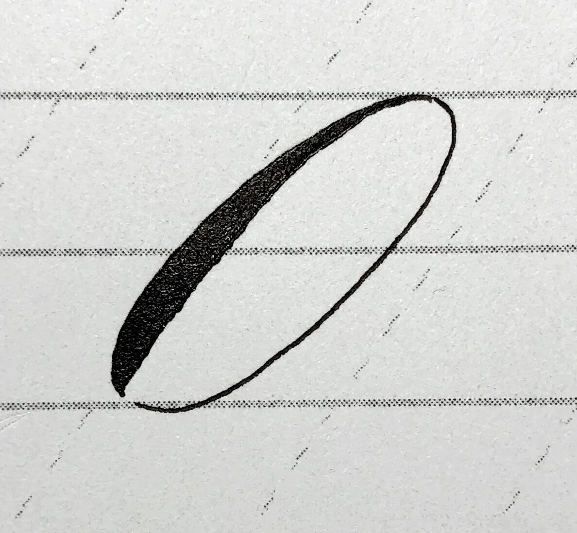
5. OVAL

See how these letters are similar to each other. The oval appears in all of the letters a, c, r, e, d, o, q, and g.
Characteristics to aim for:

The oval in this example has a shade that is bottom heavy.
The top starts with a hairline.
The top left is a big curve gradually easing from a hairline to a shade.
The shade could be bottom heavy OR could be evenly distributed, depending on your preference.
See how the right edge of the shade is almost a straight edge.
The end of the shaded stroke looks like how you curve your under turns.
The curves of the hairline mirror the shape of the shaded stroke.
Look at the negative space inside the oval and see if it is spread evenly.
Step-by-Step Process:
Here’s one way of drawing the oval.
The shade in this example is more evenly spread than the previous example. It’s up to you to decide which one you like!
Cover the top half and compare the bottom part with your under turns.
Imagine where the center of your oval would be. Trace an imaginary line to the topmost guideline. This is a good starting point.
Start with a hairline then slowly put pressure on the nib while following a curved shape on the top left.
Reach full pressure by the time you are around the middle (or later if you want the shade to be bottom heavy). Keep the shade along the slant.
When you are nearing the baseline, slowly release pressure while making the bottom turn. Mimic how you would make your under turn.
(Optional) Lift your pen and adjust the placement of your hand on the paper to make sure your fingers have a comfortable range for the next stroke.
Starting at your nib’s last position, draw a curved hairline that mirrors the curved shape of the shaded stroke.
Continue with a hairline that approaches the 55 degree slant line.
End with a curve that meets your starting point.
Note that you could also do steps 6 to 8 backwards (start from the top to the bottom). You just need to make sure you don’t put any pressure on the nib to maintain the hairline. Experiment with whichever method you feel more comfortable with.
Also note that a lot of Engrosser’s Script exemplars have an accent or a slight shade at the top right of the oval, which could be added after you’ve completed the oval, or could naturally be done when you do steps 6 to 8 backwards and apply a slight shade while doing the right curve.
For the purposes of this blog post, we will focus on getting the basics down first, without any accent shades. I’ll make a post specifically for them in the future!
Video Tutorial - Oval
6. REVERSE OVAL

The reverse oval shade as used in the letters s and x
You execute the shade on a regular oval in a counterclockwise motion while on a reverse oval, your nib goes in a clockwise direction. The reverse oval is essentially your regular oval turned upside down! This means that if you prefer your regular ovals to have a bottom-heavy shade, then your reverse ovals should match them by having a top-heavy shade. This basic stroke is used in only a few letters: s, variations of x and z.

The shade of the reverse oval is done in a clockwise motion. It should look like your regular oval when you turn your paper upside down.
Characteristics to aim for:
Exactly how your oval’s shade would look like when you rotate it 180 degrees.
If your regular oval has a bottom-heavy shade, make your reverse ovals have a top-heavy shade.
If you like your shades to be evenly spread out and centred in the middle, that’s great too!
The left side of the shade is mostly straight and lies along the 55 degree slant.
The shade tapers to a hairline at the bottom.
Step-by-Step Process:
(For the shade only)
Start at the top like you’re about to do the shade of an over turn. Slowly put pressure on the nib. Keep the left tine on the slant while focusing on making the right tine do a curve.
Either put full pressure immediately or gradually, depending on whether you want your reverse oval shade to be top heavy or centred in the middle.
Gradually release pressure once you are past the middle
Taper off into a hairline while drawing the bottom curve.
Video Tutorial - Reverse Oval
7. DESCENDING/LOWER LOOPS

Letters g, j, and y share the same descending loop stroke.
Characteristics to aim for:
Let’s look at the shaded stem.
It has a flat top resting on the header line.
The shade starts with an even shade aligned with the 55 degree slant, and it gradually thins out to a hairline that curves.
You decide where the transition point is; you could start thinning out the shade near the middle of the stem, or you could keep it pretty thick until you’re almost at the bottom, as long as you keep tapering off at the same point on letters with similar lower loops. And this transition point should be the same for your upper loops when turned upside down.
In this example, if you look at the left side of the shade, it’s pretty much straight and aligned with the 55 degree slant. The right side of the shade is the one that steers off of the 55 degree slant as the shade thins out and the curve bends. This is just one way of doing it.
You also decide how long you want the stem to be. You could draw it to hit the 2nd descender line like in the example, or end it somewhere between the 1st and 2nd descender line, or even just keep it short and end it at the 1st descender line-- as long as you keep its length consistent among your letters.
Let’s look at the enclosing loop.
The bottom curve of the loop resembles the bottom curve of a minuscule oval.
You decide how narrow or wide the bottom curve would be, but ideally, it wouldn’t exceed the width of your regular oval. This will make sense when you start writing words. Ideally, each letter occupies one unit of space that is usually based on the width of your regular oval. So if you have a word having consecutive loops that are wider than one unit of space, they’re going to overlap each other!
The hairline ends just below the baseline (where the hairline meets the shade).
Dr. Joe Vitolo has a wonderful explanation on this in his book, Script in the Copperplate Style. Basically, not ending the loop right at the baseline and instead leaving a gap underneath allows for a more graceful connection of this hairline when you draw its exit stroke, which starts right at the baseline and goes in an upward direction. If you end the loop right at the baseline and begin the exit stroke also right at the baseline, it looks a bit disconcerting because it would mean that the hairline “crossed” the shade in a horizontal line.
In some Engrosser’s Script exemplars, if you look closely, there is a slight shade on the hairline, right around the bottom left turn. You can naturally create this shade when you create the hairline from top to bottom. Otherwise, it can be added after the fact. This accent is optional, but the general reason for adding it is to give your loops a stronger and more balanced look, especially if the majority of the loop is a non-shaded hairline.
Let’s look at the negative space inside the loop itself.
It’s a long teardrop shape, with curves that are smooth and not jagged, and the space inside spreads out gradually and evenly.
If you bisect the loop in half with a line running from the upper corner to the middle of the bottom curve, you will end up with two equal-looking parts that you could imagine being able to fold nicely in half.
The loop ideally holds the same amount of space regardless of the letter it’s attached to.

The lower loop can be done in one continuous stroke or can be broken down into two strokes: the shade and the hairline. If you decide to draw the hairline separately, you also have the option of drawing it from bottom to top or from top to bottom.
Step-by-Step Process:
You could draw the lower loop in one stroke or you could break it in two strokes: the shaded stem and the enclosing hairline.
If you decide to break it in two, you also have the option of drawing the hairline either clockwise (bottom to top) or counterclockwise (top to bottom). Remember to keep your hand light if you draw it from top to bottom so that the enclosing loop is still a distinct hairline.
The steps below describe drawing it in one stroke. This is just one way of doing it; try the alternatives I mentioned above and see which way gives you the most desirable results.
Begin with how you would draw a full pressure stroke, which is with a flat top on the header line and a shade having an even width.
Gradually release the pressure at the point where you want the shade to start tapering off (your “transition point”).
Slowly pull your nib towards the left in order to draw the bottom curve.
Curve at the bottom like how your minuscule oval’s curve looks like.
Continue the hairline upwards while creating a teardrop shape. Meet the shade just below the baseline.
Click here to go back to the table of contents.
Proceed to the next section to watch the video for both lower and upper loops.
8. ASCENDING/UPPER LOOPS

Letters f, h, and k all shade the same ascending loop stroke with a flat bottom.
Characteristics to aim for:
Let’s look at the shaded stem.
The stem starts with a curved hairline, and as it gradually thickens to full pressure, the shade becomes straight and aligned with the 55 degree slant.
You decide where you transition from thin to thick. It could be higher or lower than in the example, as long as you keep it consistent not only among your upper loops, but also among your lower loops when you look at them upside down.
In this example, if you compare the right side of the shade versus the left, the right edge stays on the 55 degree slant a little longer than the left, because the left is the one that curls in more dramatically to the right. This is just one way of doing it though.
The length of the ascending stem is also up to you. In the example, it hits up to the 2nd ascender line. You could keep it shorter than that, either only up to the 1st ascender line, or somewhere in between the 1st and 2nd ascender line.
The shade ends with a flat bottom.
Let’s look at the enclosing loop.
The top curve of the loop resembles the top curve of a minuscule oval.
This can be narrower or wider, but I suggest you don’t make it any wider than your regular oval because you might get overlapping loops when you have consecutive letters with upper loops.
If you look at where the hairline meets the shade, I left a tiny bit of a gap there. When you have an entry stroke for your letter (which would look like a hairline starting from the baseline and ending right at the header line), the gap will make it look like you created the hairline in one continuous stroke.
In some Engrosser’s Script exemplars, you’ll notice a slight shade near the top right of the loop. This shade could organically be drawn when you execute the loop from top to bottom or could be added as an accent after drawing the hairline first.
Let’s look at the negative space inside the loop itself.
Turn it upside down-- it should look like a long teardrop shape, exactly how the negative space of your lower loops look like.
If you bisect the loop’s area in half with an imaginary line running from the end of the loop going up to the top curve, ideally, you should end up with two equal parts that you could imagine can be folded on top of each other.
The inside of the loop ideally holds the same amount of space regardless of the letter it’s attached to.

There are several ways you can draw the enclosing hairline: in one stroke continuing to the shade or as a separate stroke from the shade that you can also draw either from bottom to top or from top to bottom.
Step-by-Step Process:
You could draw the upper loop in one stroke or you could break it in two strokes: the shaded stem and the enclosing hairline.
If you decide to break it in two, you also have the option of drawing the hairline either clockwise (top to bottom) or counterclockwise (bottom to top). Remember to keep your hand light if you draw it from top to bottom so that the enclosing loop is still a distinct hairline.
The steps below describe drawing it in two strokes: shaded stem first, enclosing loop second, that is drawn from top to bottom and without applying any pressure. This is just one way of doing it; try other ways and see which one suits you. You could even try rotating your paper upside down and doing a lower loop in place of an upper loop!
Start with a hairline that slightly curves on the left. This curve resembles the top left curve of your minuscule oval.
Slowly pull your pen downwards while keeping it aligned on the 55-degree slant and gradually put pressure on the nib.
Reach full pressure once you are past the transition point. This should be the same transition point as your lower loops’ turned upside down.
Maintain even width till you reach the baseline and end the shade with a squared bottom.
Go back to the top of the stem and draw a right hairline curve in a way that resembles the curve of a minuscule oval.
Instead of closing it like an oval, continue drawing the hairline downwards, keeping in mind an upside-down teardrop shape. Meet the shade just above the header line, leaving a tiny gap.
Video Tutorial - Lower and Upper Loops
Last Words!
Getting good at calligraphy requires sheets and sheets of paper, and hours and hours of both studying and practicing :) The more you write and practice, the more you will get better at it. Have patience; learning any new skill takes time!
I would encourage you to especially take your time learning the basic strokes because they’re the very foundation of the script. In my opinion (and I’ve been there), if you jump straight to writing without a thorough understanding of the basics, you might find your outputs lacking and your script missing a ‘unified’ look.
Aside from training the muscle memory of your writing hand, also train your eyes by looking at different calligraphy exemplars and scrutinizing what you like and don’t like about them. You can then start incorporating the things you like into your own calligraphy script.
Take a look at these wonderful resources: