My IAMPETH Certificate of Proficiency In Engrosser's Script Application - 2022
Please note the videos and this article encompass my personal experience only.
Part 1: I show my finalized samples and talk about my struggles and the materials I used
Part 2: A quick video showing how I packed my samples in a mailing tube
Part 3: I got my results! This video shows my candid reaction. I also show my scores and the feedback I got from the judges.
IMPORTANT:
IAMPETH changes some of the required text every year, so make sure to read the current year’s requirements thoroughly.
All official details about the program can be found here.
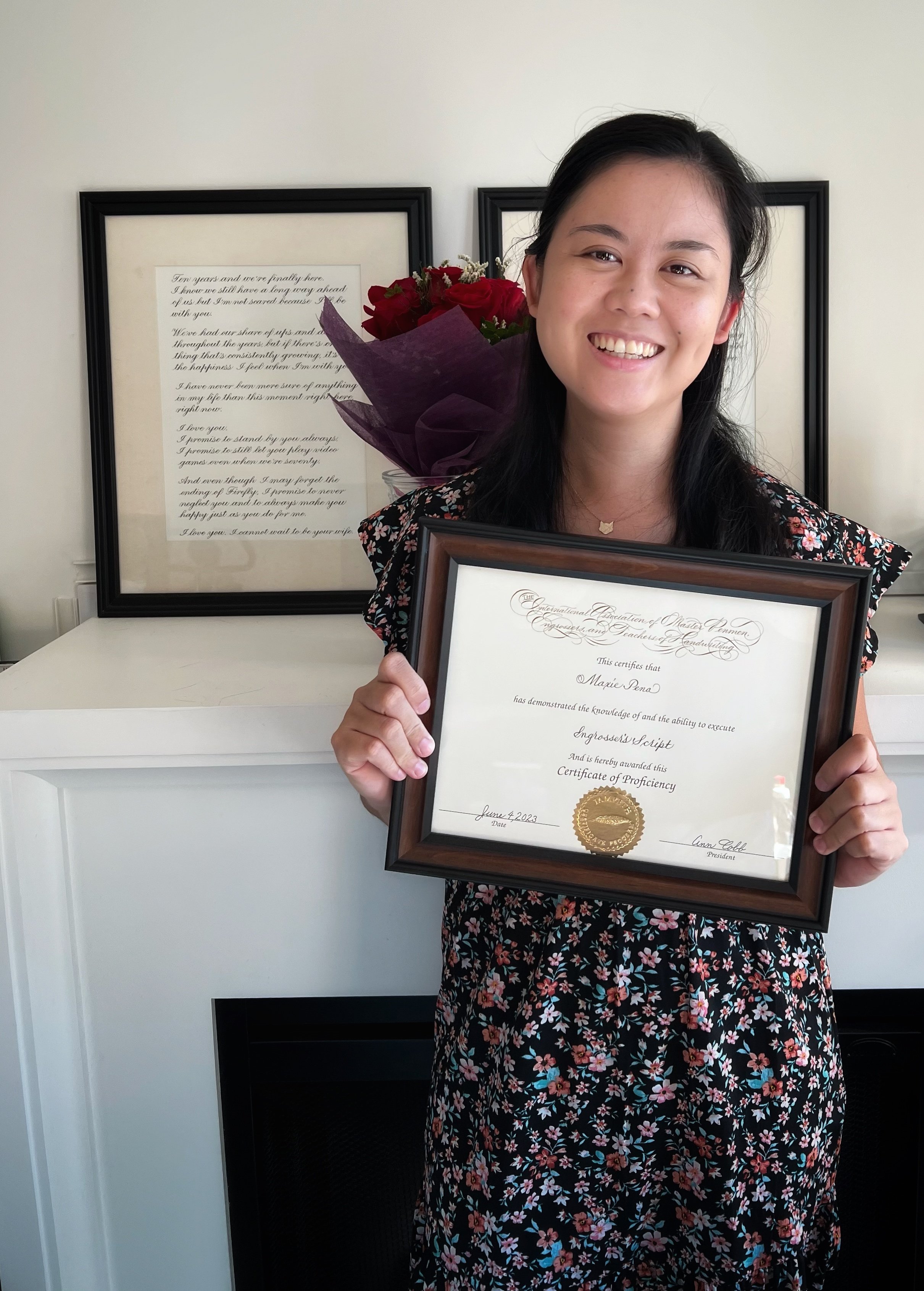
2022 marked my third year as an IAMPETH member which meant I was eligible to apply for the first level in their Certificate Program. This was one of my biggest calligraphy goals to achieve that year and I’m so happy to report that I did it! I successfully passed and received the Certificate of Proficiency in Engrosser’s Script in June 2023.
I recorded these three videos to document my application, and while I mostly just talk and didn’t record my live writing, I hope you find the details useful. I certainly wished there was more relatable info like this while I was doing the project!
How I divided The months
The deadline for shipping your application is October 31st. IAMPETH released the actual requirements in the beginning of September, which meant I only had about two months to draft and finalize my samples. I wanted to be more prepared so I started looking into it a month early - in August. I also didn’t want to send it out on the very last day so I finalized all the pieces in the middle of October.
Things you could do ahead of September
Study the reference.
For Engrosser’s Script, the Zanerian Manual has remained the standard in the past few years and I don’t see that changing any time soon. Print the pages out. Print the letters out BIG. Draw guidelines on them to understand the proportions. Read the text instructions.
Identify areas that require more study and practice for you. Use the time to practice your script.
For me, I knew that my majuscules needed work, as well as my loops and their accent shades. I also rarely wrote numbers when doing calligraphy so I knew I had to spend extra time studying them.
There are three samples required for the Certificate of Proficiency. Use the previous year’s sample requirements as inspiration for practice. (You’ll have to be an IAMPETH member to view it on their website.)
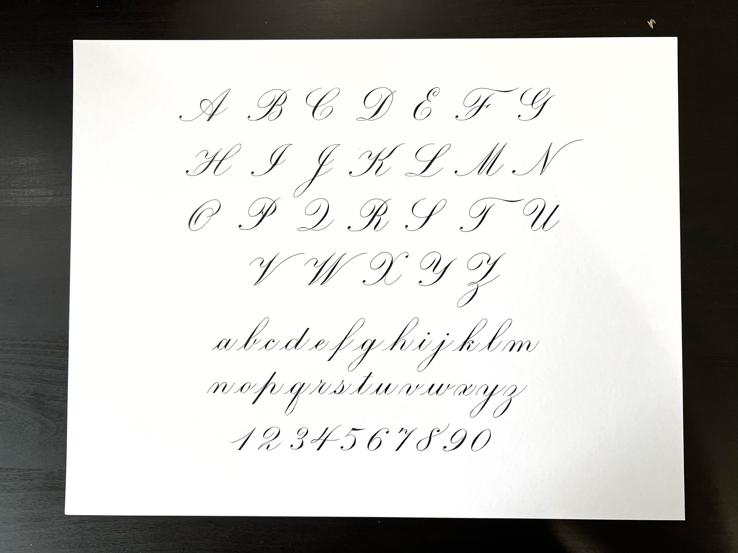
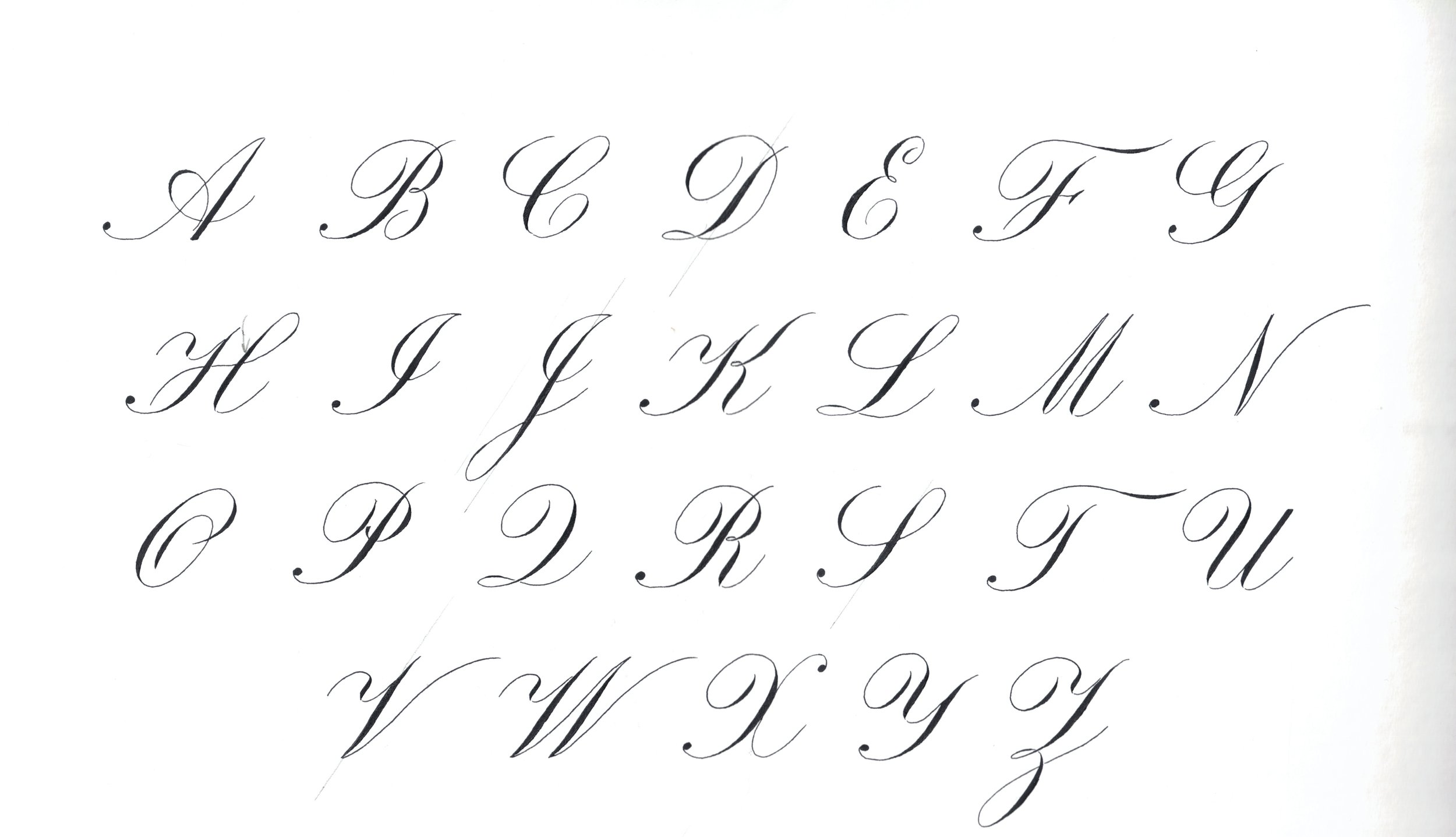
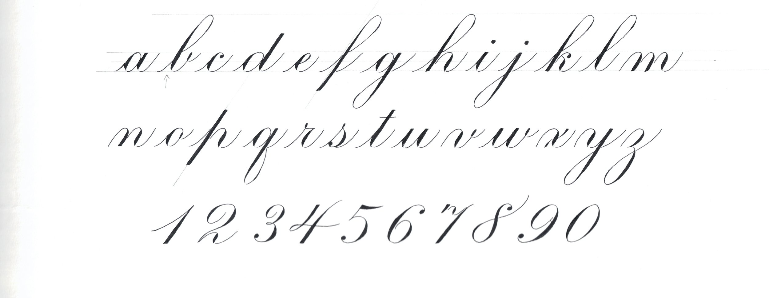
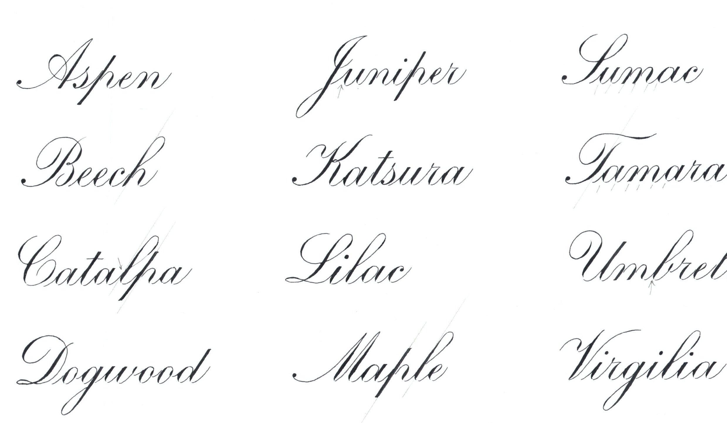
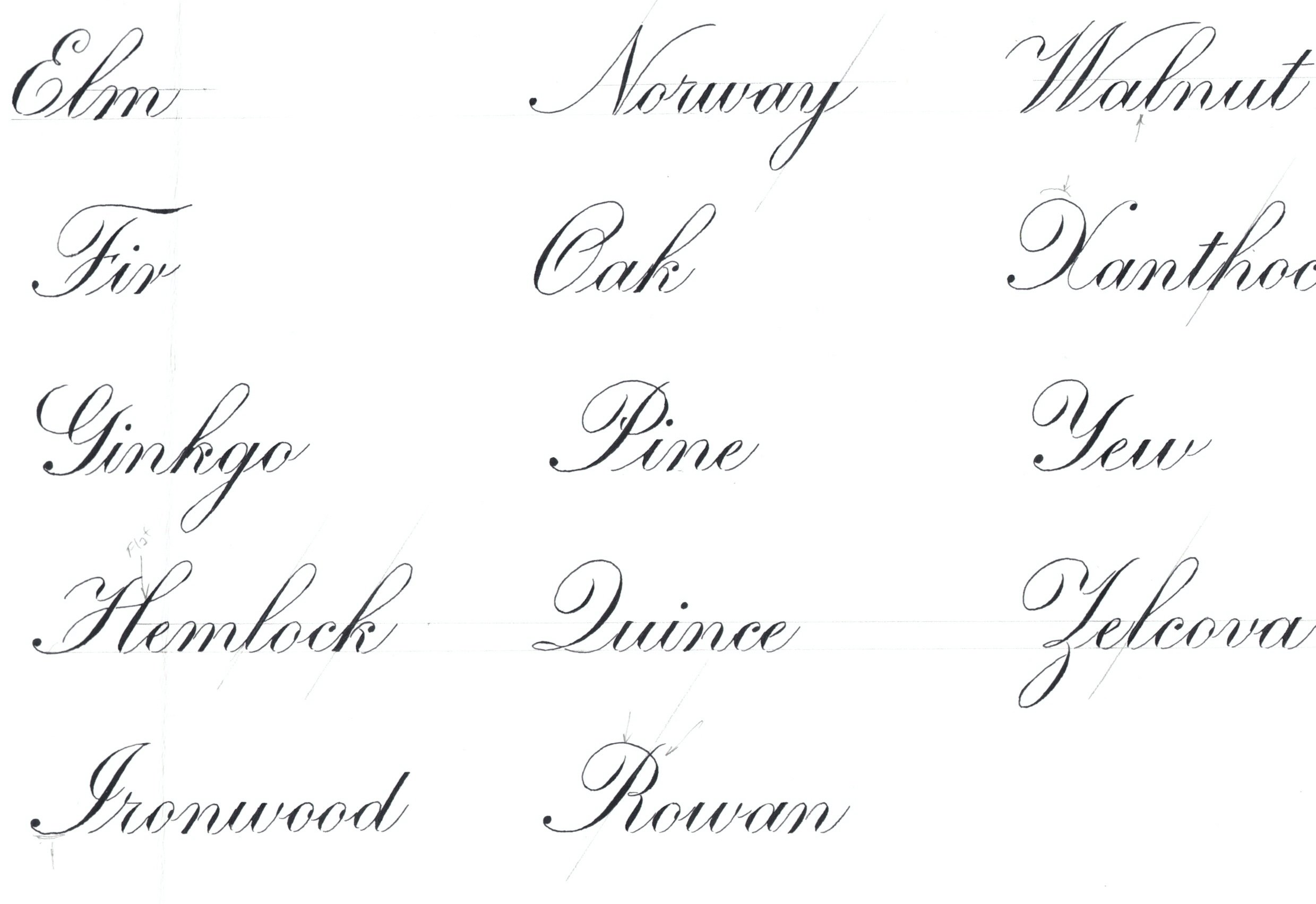
The alphabet exemplar seems to be a constant requirement each year and is therefore a safe bet to practice. Not sure how variable the x-heights and paper size get every year (in 2022 it was ¼ inch on 11 x 14 paper) but you can certainly start thinking about how to lay the letters out on paper, and adjust it to the proper size later. You’ll need to demonstrate majuscules, minuscules, and numbers.
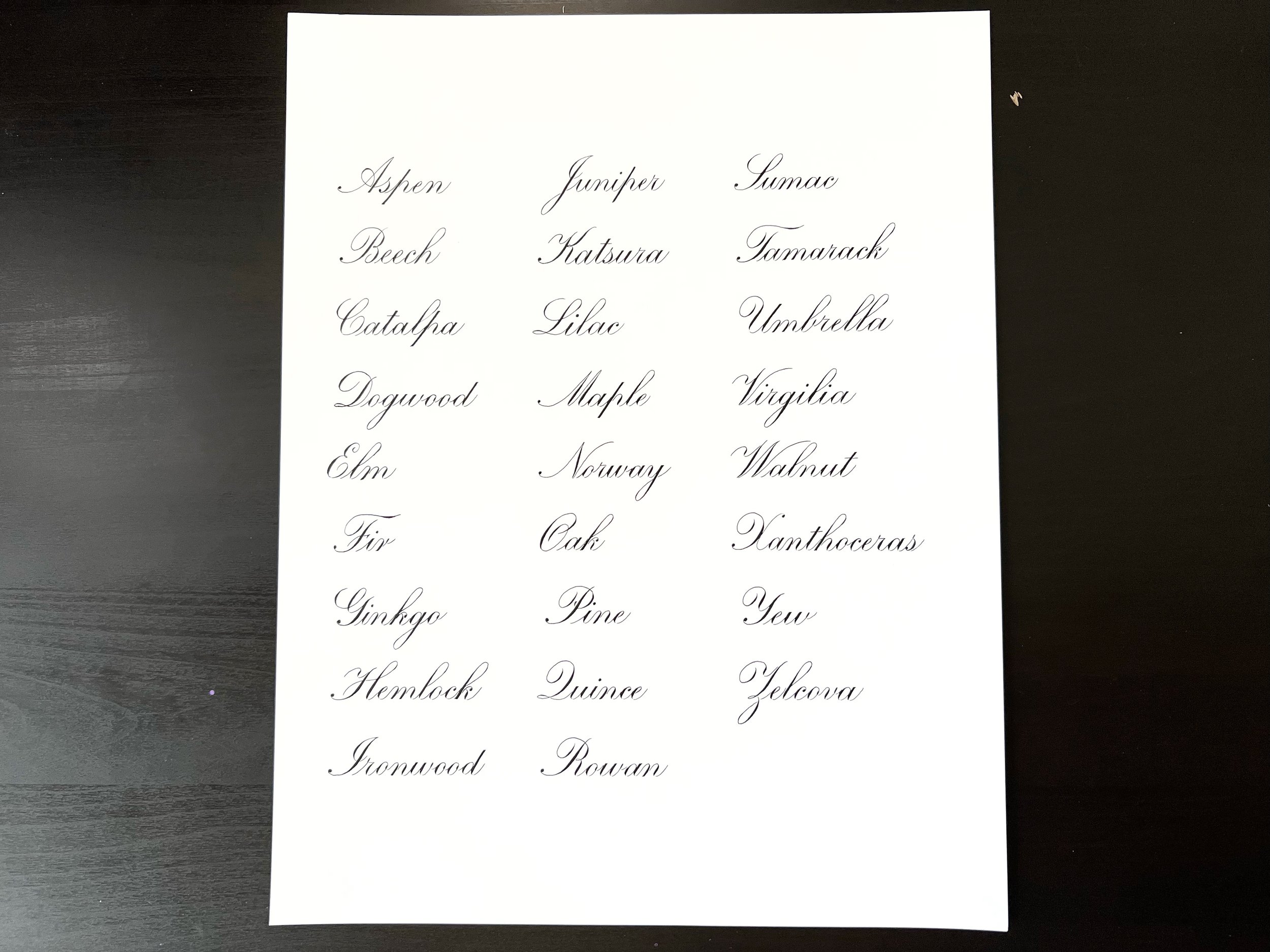
The list of names consists of 26 names from A-Z, with each first letter capitalized. The exact words get changed every year but since it’s always going to start from capital A to capital Z, you can start practicing how to align these first letters on the page. Note: in 2022, the x-height required was ⅛ inch.
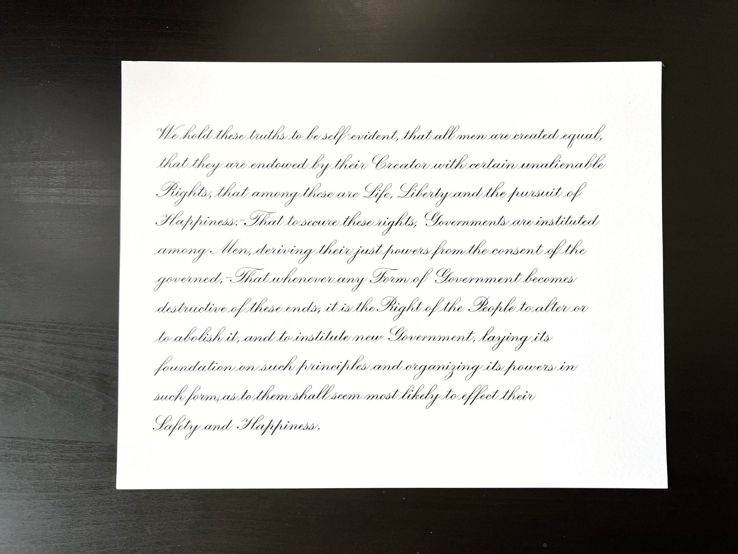
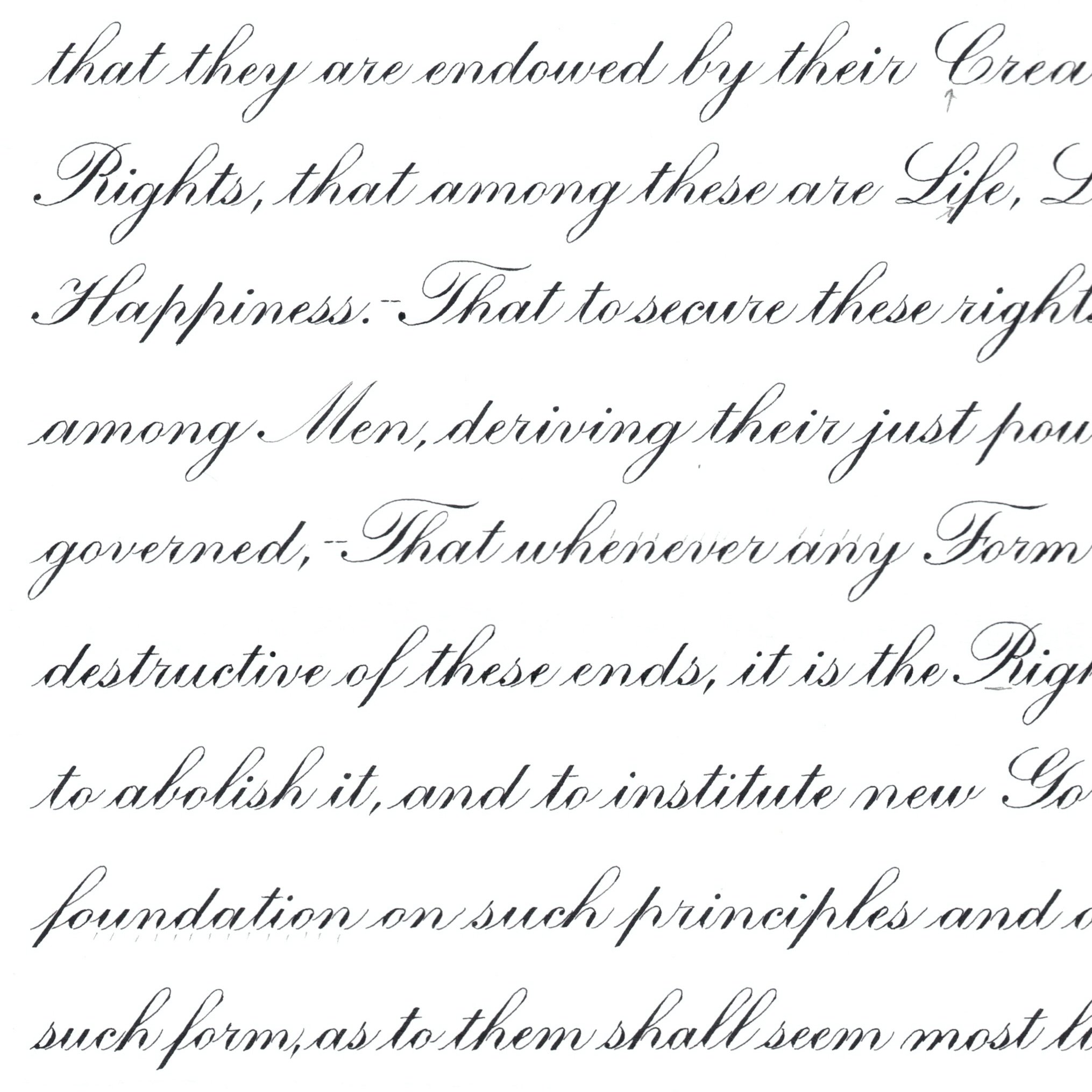
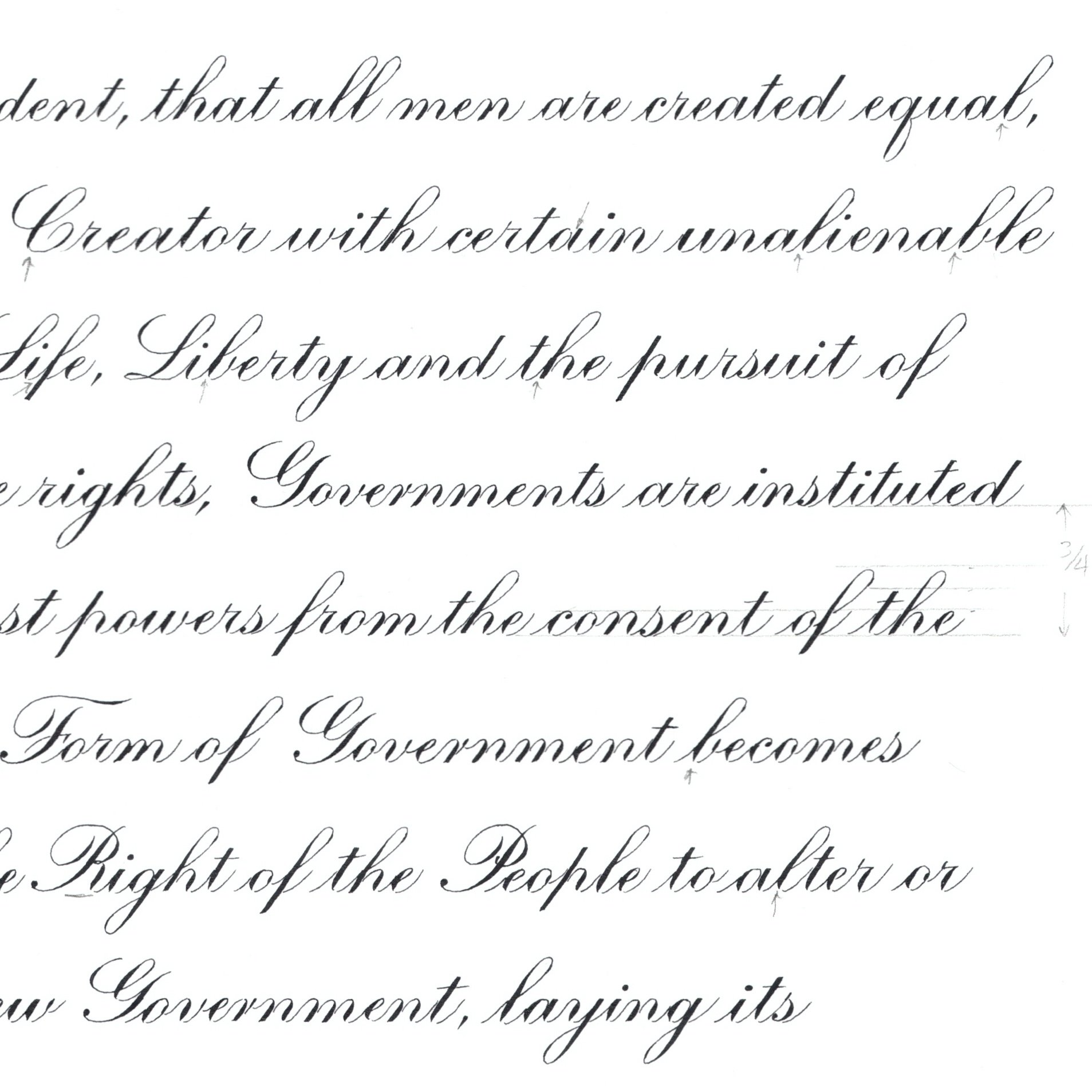
The third sample used to be three pangrams, but got changed to a text block in 2022. There’s no telling what it could be in the upcoming years, but I think it’s a good idea to practice either last year’s text or any kind of quote in the x-height that the previous year’s sample was on, which is the smallest x-height of the three samples. I found it quite a challenge to write in the 3/16 inch x-height!
Things to do once the requirements are out (SEPTEMBER)
Gather the materials. Test your paper, ink, and nib combination.
I got overzealous with this one and bought the previous year’s required paper weight before the current year’s requirements were out. The 11x14 size remained the same but the weight however got changed from 60 pounds minimum to 90 pounds and I only noticed after I’ve already produced the name list sample!
The paper needs to either be white or cream colored. I used Fabriano Bristol Smooth and Fabriano Bristol Vellum which were both at 100 lbs. I suggest choosing smooth papers over textured ones as it’s easier to make quality hairlines with tall x-heights on a smooth paper. It’s imperative of course that you test everything out.
They required the ink to be black. Initially I planned to use Moon Palace Sumi Ink, but I didn’t get fine hairlines with my bottle. I decided to go for an iron gall ink. I had Fox and Quills Red Wine with me and I tested it on my chosen brand of paper to make sure it returned black on the page after drying.
I switched from Hunt 101 to Hunt 22b and then finally settled on Nikko G because it was the best nib that showed great hairlines and a good shade control on the paper that I used. Take into account that you will be working with varying x-heights and some nibs are more flexible than others. For example, I don’t recommend using a Hunt 101 on the 3/16 inch x-height. There are other stiffer nibs that are better suited for creating delicate lines on that small an x-height. Also, don’t be stingy on replacing your nib the moment they feel scratchy. You run the risk of ruining the quality of your piece if your nib suddenly catches on paper, drags ink or splatters it around.
Decide how you will handle the x-height measurements. Additional materials needed: ruler (in 8ths of inches), mechanical pencil (0.3mm HB lead), light pad, guide sheets from lanquach.com.
I was a bit stubborn in the beginning, insisting on having the guidelines penciled right on the page. I personally prefer practicing on paper with the guidelines on them, rather than using a light pad, because it helps me with hitting the baseline and top lines, and getting the slant more precisely. The huge disadvantage is that it takes a lot of time, effort, and attention to pencil it on the paper. You will have to erase it after the ink has dried too, so make sure that if you go this route, that you use an easy-erase kind of paper and a light and thin pencil lead (HB, 0.3mm lead). Some of my biggest frustrations with this method are that a) I encountered inaccurate rulers where the space on one end is bigger than the other end, b) when you’re not paying attention it can have a domino effect - you make one uneven guideline and the rest of the spacing will be wrong, c) when I make a mistake on the page, I would have to re-rule all over again.
You can choose to pencil in the words to help gauge the spacing and to plan the line breaks. It also helps in avoiding spelling, capitalization, and punctuation mistakes. I personally only penciled a letter directly on the page for the text block sample, every time there is a capital letter in the next word, so that I can make sure the spacing looks right and not disrupted. I think penciling the whole text block is unnecessary because you can’t really accurately account for the shades you’re going to make. For the name list, I also penciled in the first letter to make sure I have everything left-aligned.
I highly recommend that you print guide sheets from lanquach.com. You can use them for practicing and for placing them underneath your piece and on top of a light pad. They have presets for the x-heights required in the IAMPETH certificate application. If you’re like me whose printer can’t print anything bigger than letter size paper, you can edit their guide sheet settings to print to the size and orientation you need. I printed the guide sheets off in landscape and letter size.
I eventually gave in and used a light pad. At first I really didn’t want to because even though my light pad was thin, I could still feel the difference in my writing when I’m using it because my arm would be slightly raised from the table. I also found that my eyes get tired more easily when the light source is coming from underneath my paper versus from on top. What I did was to layer it this way: light pad + guide sheet + blank paper, or light pad + guide sheet + draft + blank paper. It helps having a draft underneath to trace from when you need it, or to assist with spacing and layout.
Get the details of what to write. Pay attention to the spelling, punctuation, and capitalization.
Since I knew my majuscules weren’t super polished, I made a list of which capital letters were used in the text block sample and made sure to spend extra time practicing them.
I also made the decision to use a simpler version of the comma (press and release) instead of the fancier-looking one (dot and curve) because I am able to do it more consistently in that style.
Don’t be afraid to start! (And start early!)
It took me some courage to draft on the 11x14 paper size. I initially limited myself to practicing on my regular guide sheets because it was just so daunting for me to start! Don’t be afraid to “waste” paper. Each draft you scrap is not a waste. In my experience, the second draft is better than the first, the third better than the second, and so on.
Self-assess. Write down the things you struggled with. You get better with each try as long as you pay attention. Compare your work with the exemplars in the Zanerian Manual.
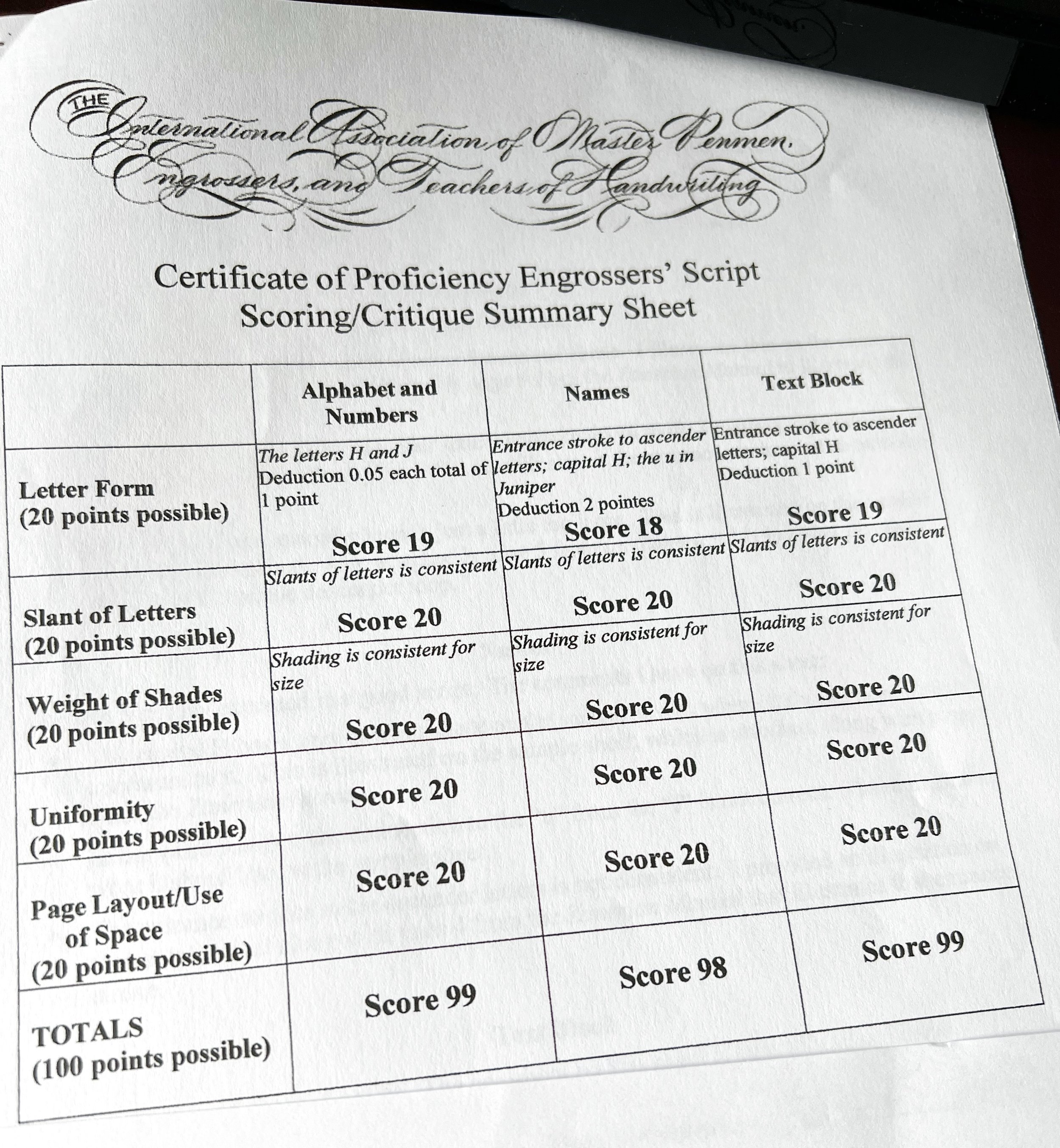
Avoid cramming and start early so you have the allowance to draft and redraft when you’re not happy with the result. You will need to score 18 out of 20 for each of the five criteria for judgment.
To make it less daunting, you can draft it pencil first and not put pressure on getting it right the first time. You can first focus on allotting the proper margins and using negative spaces in a pleasing way. Plan the interlinear spacing to make sure your loops don’t collide across consecutive lines. Decide on the alignment of your words or lines as well.
Keep the five criteria in mind. Keep the reference near you always.
The criteria for judgment are: Letter Form, Slant of Letters, Weight of Shades, Uniformity, and Page Layout & Use of Space.
Make sure you’re not doing letter variations that are NOT in the Zanerian Manual (e.g. there are several versions of the lowercase r, x, k, f out there, make sure the one you are using is in the book).
Other details to pay attention to:
Pay attention to the spacing between words, before and after commas, and before and after capital letters.
Pay attention to where your hairlines meet the shades (which letters have the entrance stroke reaching up to the waistline, which ones reach only halfway to the waistline).
My mistakes during drafting stage/things I would have done differently
Using the wrong weight of paper. Make sure to read the requirements thoroughly before starting!
Using a ruler that was inaccurate and uneven. Cross check your measurements or your penciled-in lines against a printed out guide sheet.
Refusing to use a light pad in the beginning. It was such a time-saver later! Use a combination of light pad, guide sheet, and an initial draft under your page.
Not using an initial “model” draft right away. It helps to have a draft where layout and centering is important (e.g. the alphabet exemplar).
I ruined a piece by using a ruler to cross my t’s when the drink hasn’t fully dried yet.
Not guarding the paper against the oils and sweat of my hand. You need to use an extra sheet of paper in between, sometimes the ink does funny things on the page like not following the scoring made by the tines of the nib and going over, or not adhering to the paper at all.
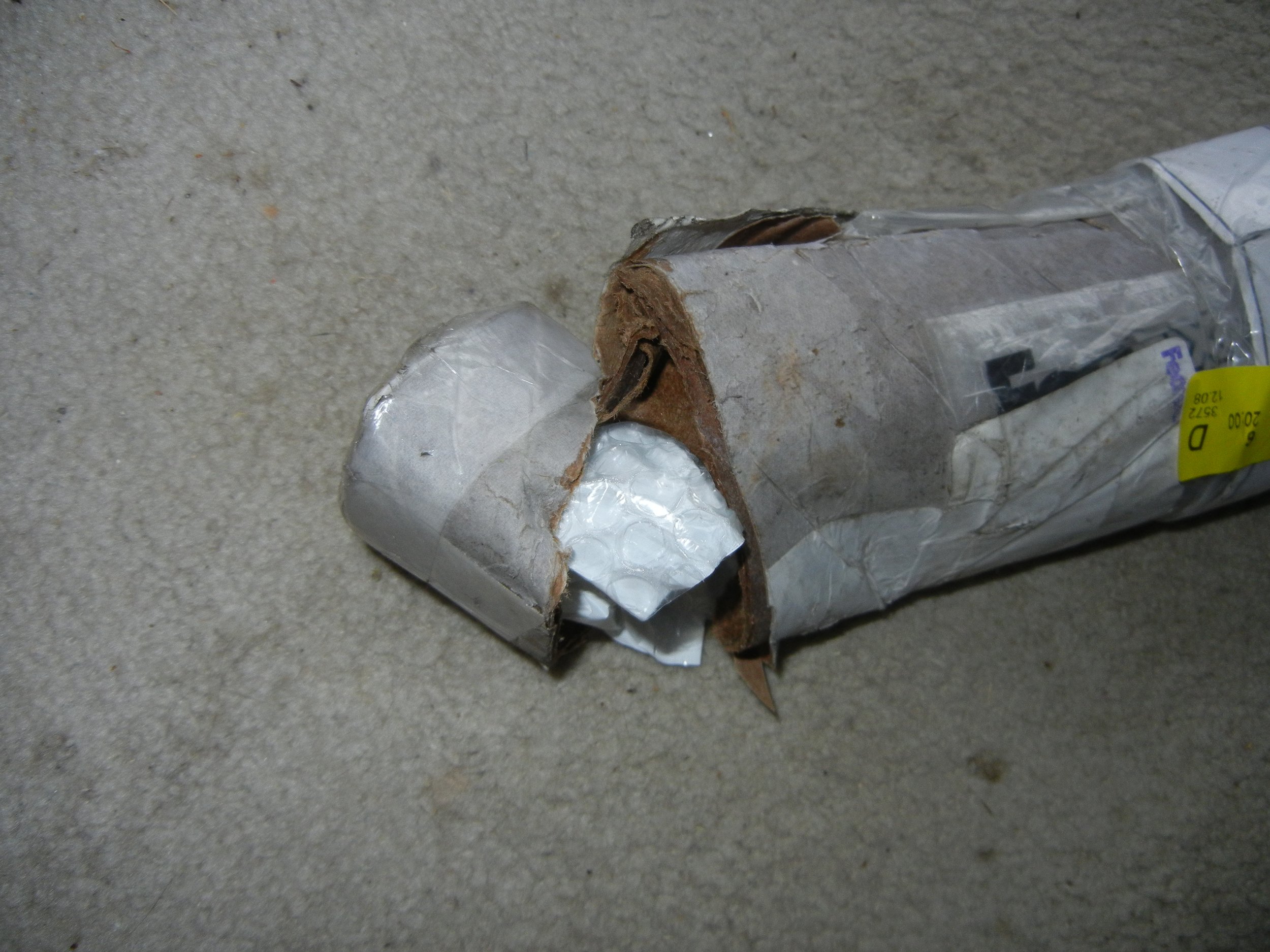
Packing it up: Mailing Tube, Bubble Wrap, Scotch Tape
I inserted blank papers in between my samples and rolled them up with my application form in the middle. I also had my return address labels inserted there as instructed. I then wrapped it all in bubble wrap before putting it inside a mailing tube. The tube I had was longer than my paper so I put scrap bubble wrap on both ends of the tube. After securing the cap, I taped both ends with scotch tape a few times.
I would do it differently the next time around. I would just use a flat envelope. I’d insert it in a plastic slip to protect it from getting wet. And I’d then declare it as “artwork” next time. See below why.
SENDING THE PACKAGE: Timeline
October 16, 2022 - finalized all three samples
October 22, 2022 - mailed via FedEx
October 26, 2022 - arrived in Nashville, TN
December 7, 2022 - customs cleared in Memphis, TN
December 8, 2022 - sent back to Nashville and delivered
My package got stuck in customs for seven weeks!
I sent it through a FedEx retailer near me. They asked if the contents were “documents”, and I, not knowing that there were more specific options, said “Yes”. As a result, my package got held up in customs. They suspected it wasn’t just documents because I had used a mailing tube. I called FedEx again and again to explain and describe what was inside but their action on it was really slow going. The trace agent later on advised me that I should’ve declared it as “artwork” instead of “documents”.
When it finally got delivered, the package was mishandled! It arrived wet and a little bit flattened - I complained to FedEx and I did get my money back but imagine the horror I felt at seeing the photos, thinking that all my hard work had been ruined. Thankfully though, my samples were intact. They were flattened a little bit but they were dry. I’m really glad I wrapped them securely enough.


Receiving the results: TIMELINE
May 25, 2023 - judges’ deliberation/scoring
June 5, 2023 - results mailed back via FedEx
June 14, 2023 - received with a certificate attached
I did it!
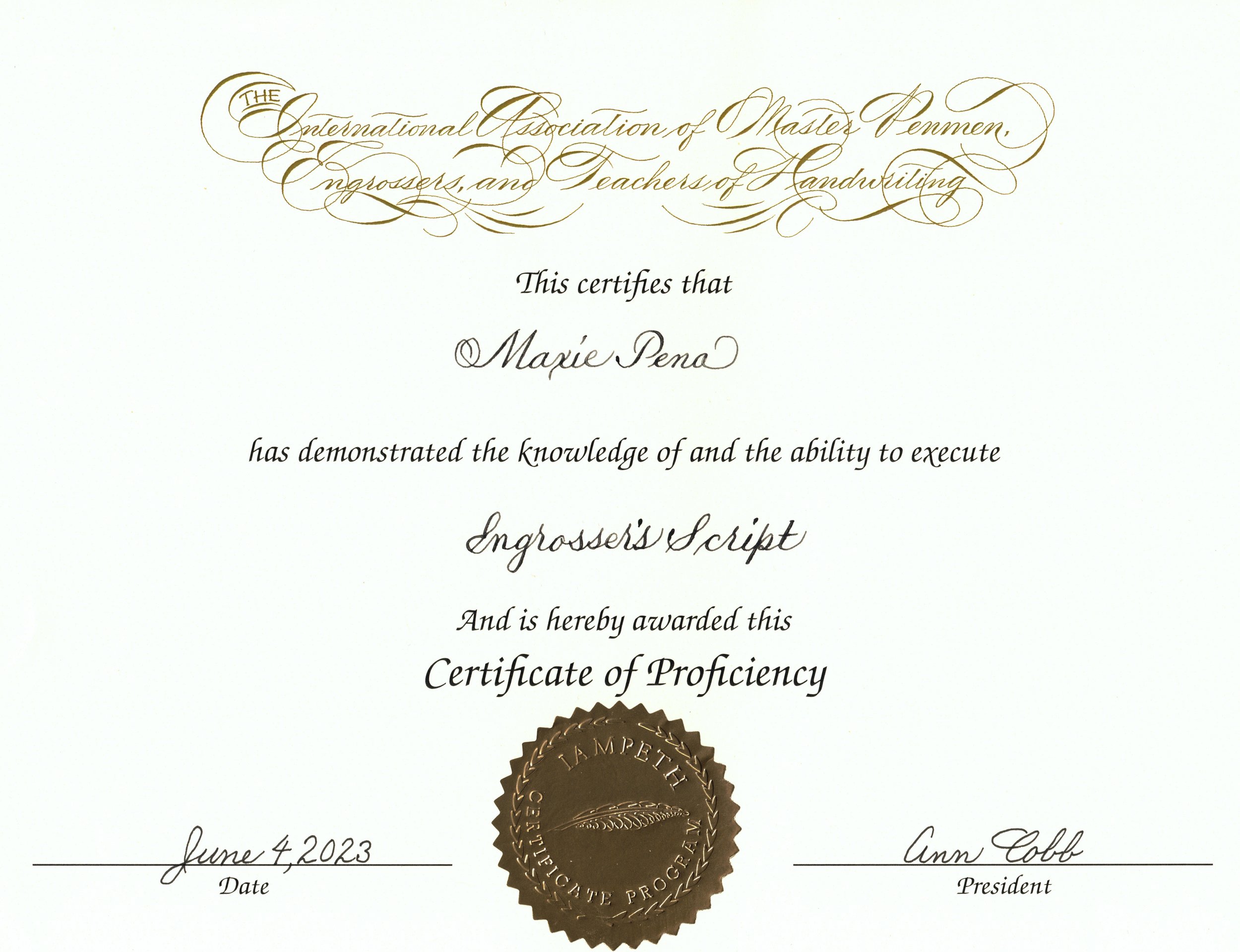
I passed! The package contained a cover letter, the judges’ scores and comments, including a couple of pages where they demonstrated what they meant in their feedback. They also enclosed a copy of the Engrosser’s Script section of the Zanerian Manual. My samples were returned with penciled marks on them together with a Certificate of Proficiency signed by the current IAMPETH President.
Judges’ Comments and Critique
I found it really helpful that the judges included a sample of their own to refer to while reading their comments. That feels like going the extra mile and I really appreciated they took the time to demonstrate what they meant.
My deductions came from the Letter Form criteria. I lost one point each on the alphabet and text block samples, and two points on the name list sample. The usual suspects are:
The second shade of my capital H was too straight. This part needs to have a subtle curve (almost to look like a C).
The entrance stroke to my upper looped letters should reach up to the waistline but I didn’t pay enough attention and care to preserve them. I had quite a few where the entrance stroke got overlapped by the succeeding shade and therefore only looked like it reached only halfway through the x-height, and the negative triangular space underneath was smaller than it should have been.
A couple other notable mistakes I made were:
The loop of my capital J was too large in the alphabet sample.
The entrance stroke of the lowercase u in Juniper reached up to the waistline when it should have stopped midway per the judges. I attribute this mistake to me not having the main shades on the same slant.
A bonus suggestion was made by the judge to decrease the vertical space in between the lines of my text block, as per how Lupfer had written with in the past. The judge didn’t provide a reference but I imagine you can find it in the Zanerian Manual. I’m still pretty happy though with my interlinear spacing, I had just wanted to completely eliminate the risk of loops colliding with each other.
What’s next?
I can apply for the Certificate of Excellence next, which requires me to send one sample - my own written certificate. The exact words, x-heights, and paper requirements are yet to be announced as of writing this in August 2023 but I’m very excited to tackle this next level.
I am also eligible to apply for a Certificate of Proficiency in a second hand/script. I was thinking of Spencerian Script but I really need more time to study and practice that one. So this year I think taking on one challenge is enough.
Final thoughts
For me personally, this has been quite a challenge, not only on the writing level but also on the emotional level. I set high standards for myself, and why wouldn’t I - the minimum score was 18 out of 20 per criteria! As a result, with each small mistake, I would scrap and try again. I did around eight iterations on the alphabet and name list samples, and five on the text block. It gets emotionally taxing to do it again and again, to subject yourself to feeling like what you produce (and in your mind, you) are not good enough!
On the positive side, you DO get better with each try. You learn from your mistakes and you learn to laugh away the frustrations that arise along the way. You learn to be more kind and patient with yourself. You learn to be brave by putting yourself and your work out there to be judged.
I am thankful for this program because it is giving me a yearly goal to tick off, a yearly project to look forward to accomplishing. It does feel awesome to have that validation (my grade-conscious self was so smug when I saw my scores). It is great to have a certificate under your belt from a renowned and respected organization, but also, remind yourself that your self-worth is never defined by a piece of paper.
My affirmations during the process
You are good enough as you are right now. This is where you’re meant to be. This is just a snapshot of your work at this point in time.
Your self-worth is not going to be defined by a piece of certificate.
What’s the worst that can happen? If the samples aren’t deemed good enough, you can always apply again the next year. You will learn a lot from the judges’ feedback. You can improve even further.
This one is a personal one - I am a calligrapher and nobody can take that away from me. Not even me.