3 General Attributes - Script Analysis
In studying different exemplars, I’ve decided to first take the approach of looking at them from a relatively zoomed-out point of view.
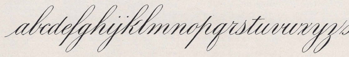
In this post, I list out the top three overarching qualities that a script generally follows. They are, in my opinion, contrast, harmony and symmetry. I propose that these are the top three key observable features that make one’s script beautiful and visually balanced, no matter which style of script you’re studying.

Script by W. A. Baird
General Attributes
GA01 - Contrast

Script by E. A. Lupfer
Illustration by Maxie Peña
Contrast basically means to be distinctly different.
A basic example is how we vary the weight of the stroke. In Copperplate or Engrosser’s Script, there is a clear distinction between shades and hairlines (thick and thin strokes). In general, shades are found on the downstrokes and hairlines on the upstrokes. This is due to the design of the pointed nib; it is able to flex when pressure is applied.
Shades are created by applying pressure on the nib while moving it in a downward motion (downstroke). The pressure allows the tines of the nib to open up. The tines create grooves on the paper which set the boundaries of up to where the ink will flow.
Note that the nib isn’t designed to create shades in an upstroke, unless you rotate the pen in that direction.
Hairlines can be created in any direction as long as you don’t apply any pressure on the nib. The tines will remain closed and the ink will flow through the tip of the nib.
Accents - You’ll notice that loops may or may not have a dainty shade on the hairline when you study different exemplars of Engrosser’s Script. When the accent is present, its thickness is not as bold as the main shade, but it is distinct enough from the regular hairline to draw just the right amount of attention.
Accents can be made by pressing lightly on your nib, either while the drawing the loop downwards or if you had drawn the loop upwards, by going over it a second time.
Note that the transition between thick and thin is gradual. A hairline doesn’t immediately bulge into a shade and vice versa. Care and moderation needs to be exercised when applying and relieving pressure on your nib. Allowing the proper transition between contrasting thickness gives a sense of grace to your script.
GA02 - Harmony
I use the term harmony here to refer to the pleasing arrangement the components of your script take in relation to each other.
A couple of easy examples are
when the downstrokes lie on the same slant and are consequently parallel to each other and
when the upstrokes observe similar imaginary ovals and thus become nearly parallel to each other.
The placement and repeatability of similar strokes give out a sense of harmony in your script.

Script by E. A. Lupfer
Illustration by Maxie Peña
In this example, three out of four downstrokes in kl are parallel.
If you go back to Lupfer’s full a-z exemplar, you’ll find that k is the only letter containing a shade that obviously veers away from the general slant of his alphabet. Also, its length makes k taller than h. We can surmise that a couple of reasons for doing this are: to avoid clashing it with the loop and to improve legibility by distinguishing k from h enough from each other.
Even so, notice how the slant of the top shade relates to the slant of the hairline connecting k to l. Observe how the harmony is maintained in the negative space.
Study other variations of k and see how they may or may not harmonize with the rest of the letters.
Script by E. A. Lupfer
Notice the harmony among the hairlines. The same right curve is carried over all of them.
Note, though, that the imaginary oval illustrated here is only one of many others that you may see or draw. The exact measurement of the oval itself does not matter; instead, pay attention to how close the upstrokes stay true to using the same curvature in the different parts of the letter. The oval is repeatedly implied across the script, resulting in harmony among the curves.
For l, you might notice that the bottom counter-space is narrower than that of the k. That’s because this was cut off from the a-z exemplar where the next letter is m, calling for a tighter turn. Even so, the harmony is preserved by the exit stroke not diverging too far away from the same exit used in k.

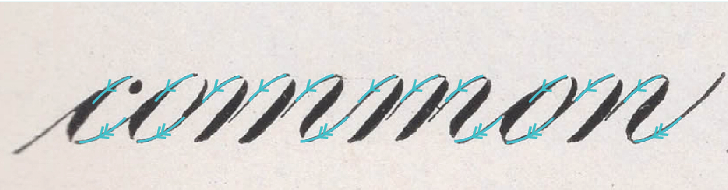
Script by E. A. Lupfer
Illustration by Maxie Peña
In the word common, harmony is maintained not only by having the same slant on all the downstrokes, but also by replicating the same left curves at the top turns and the same right curves at the bottom turns.

Script by W. A. Baird
Illustration by Maxie Peña
I think about left and right curves this way: if I divide the (imaginary oval) shape lengthwise and in half, does the curve lie to the right or to the left of the dividing line?
Script by W. A. Baird
Illustration by Maxie Peña
GA03 - Symmetry
Symmetry promotes balance in the script, and in a sense, also contributes to harmony. I’ve decided to separate it as the third general attribute so we can further identify where and how we can use symmetry to elevate our script.

Script by E. A. Lupfer
Illustration by Maxie Peña
Rotational Symmetry - The shapes stay the same when they’re rotated. In this script, most basic strokes have an equivalent when they’re rotated upside down (180 degrees).
Think of the underturn and overturn, as well as the upper loop and the lower loop.
Reflection Symmetry - One side mirrors the other when the shape is divided by a line.
For example, let’s disregard the shade and bisect an oval in half, lengthwise. The more symmetrical each part is to the other, the more balanced it looks.

Script by E. A. Lupfer
Illustration by Maxie Peña
There is another type of symmetry called Translational Symmetry, which basically means the shape is translated or moved from one place to another without rotating or reflecting it. This is reminiscent of our parallelism examples under harmony.
These three types of symmetry don’t necessarily have to be employed together all the time, every time. Depending on the letter or word, choose which type of symmetry that allows the script to look more consistent in your eyes. And don’t fret if it’s not exactly symmetrical. We have human hands and human eyes and our flaws are what makes our script interesting and unique.
What are other examples you can think of that exhibit these three general attributes? What opportunities for contrast, harmony, and symmetry do you see in your script? How are they utilized in the exemplars you are following? I encourage you to use these as goals to follow in your script and to see where they take you.